Maybe It’s Time for a UI Facelift?
September 10, 2019 - 6 min 30 sec read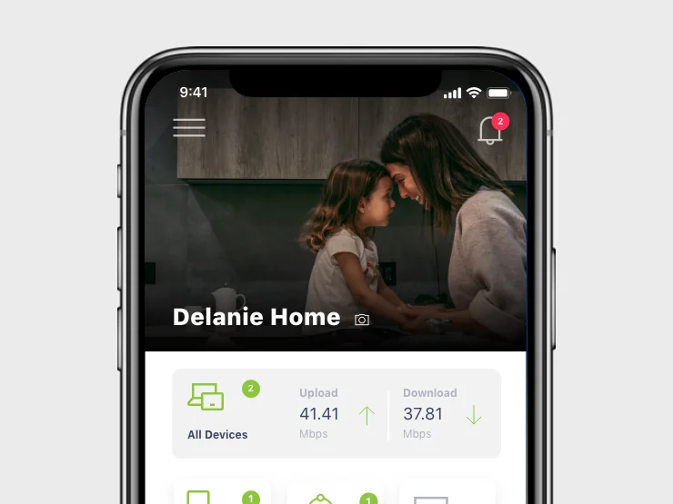
Here is a common scenario. Your website has been chugging along and your customers seem happy. They are able to get things done without much fuss. But user growth has stalled. You’re down a bit in search results and traffic from Google isn’t what it used to be. You notice more users than ever are hitting your site from mobile devices – but your site isn’t perfectly formatted for smaller screens. To cap it all off, you see that your main competitor recently updated their website to a more modern look and launched an app. You don’t have the time – or the budget – for a big redesign of your brand, information architecture and content. How can you stay competitive?
Since your product and services are as good as ever and customers are generally feeling good with your digital property – you might need a user interface (UI) facelift. A quick recap – your UI is the visual part of your website, app or software that customers use to interact with. When digital designers talk about “UI design,” we are concerned with the efficient “layout” of screens and the use of visual design elements, including type, color and spacing.
Your UI is a critical part of delivering a great total user experience and while a total UX redesign can be complex – a UI facelift can deliver immediate positive results.
What’s a UI facelift?
The concept behind a UI facelift is simple. It involves updating the way your digital product currently looks and feels, and leaves its inner workings (code, functionality, basic structure) unchanged. A UI facelift isn’t a wholesale website or app redesign! A user interface facelift applies modern digital design standards to what you already have to ensure your UI gives a great experience for every kind of user. Remember, the way modern digital interfaces work is continually evolving. Thank Apple, Google and a long list of others for that. Customers (AKA users) have come to expect websites, apps and software to “work a certain way.” Simple, intuitive, speedy UI design that works across all devices is now the norm.
If you fail to deliver on how people expect websites and apps to work, they will get frustrated. You’ll hear all about it, or worse, they will simply go elsewhere. Your UI is one of the first impressions users have about your brand and your products – so every cliché about “putting your best foot forward” applies.
Because updating visual design elements are at the heart of a UI facelift, the way your website, app or software looks will change. Done by professionals, this update is always a change for the better. The result is that your UI will be updated to modern standards, perform in ways users have come to expect, be optimized to work perfectly on all popular devices and will be simply useful.
UI facelifts – Real-world examples
At Interpix Design, we’ve been helping clients perfect the UI design of their digital products for more than 20 years. With that experience comes the knowledge that sometimes you don’t need to reinvent the wheel. If the basics of your digital experience are performing well - but data reveals that you could be doing more to meet user needs – an updated UI could do the trick.
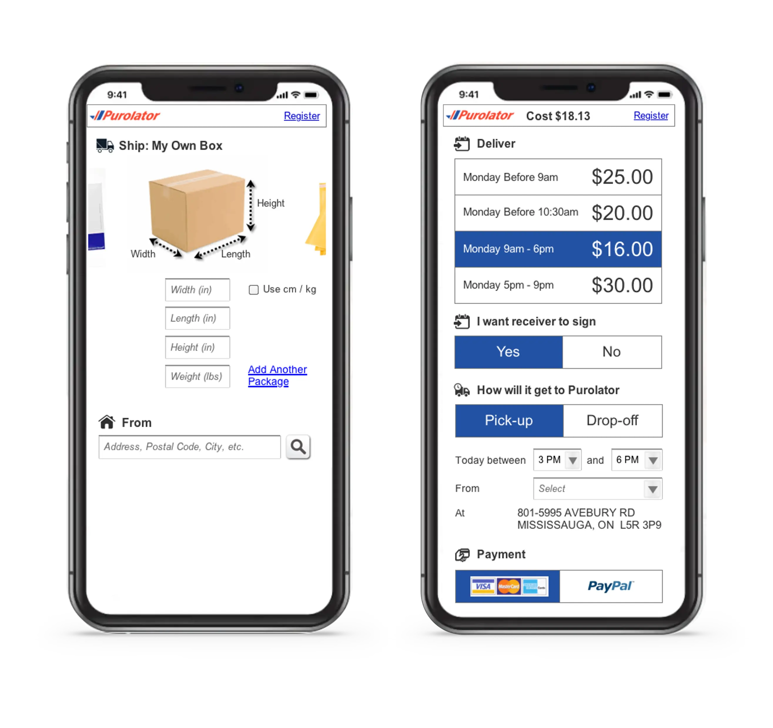
UI facelift example 1: LABORIE
Let’s start with an example of a reasonably straight-ahead UI facelift. LABORIE is an industry-leading manufacturer, supplier, and global developer of medical technologies and devices. They design and develop next-gen digital solutions, and their technology is used by patients worldwide. They engaged Interpix to design a new look and feel for their Synergy product to ensure it delivers a consistent, modern user experience. The new UI had to work within an existing structure and on a defined operating system min-spec, namely Windows 10.
Synergy user interface before a UI facelift
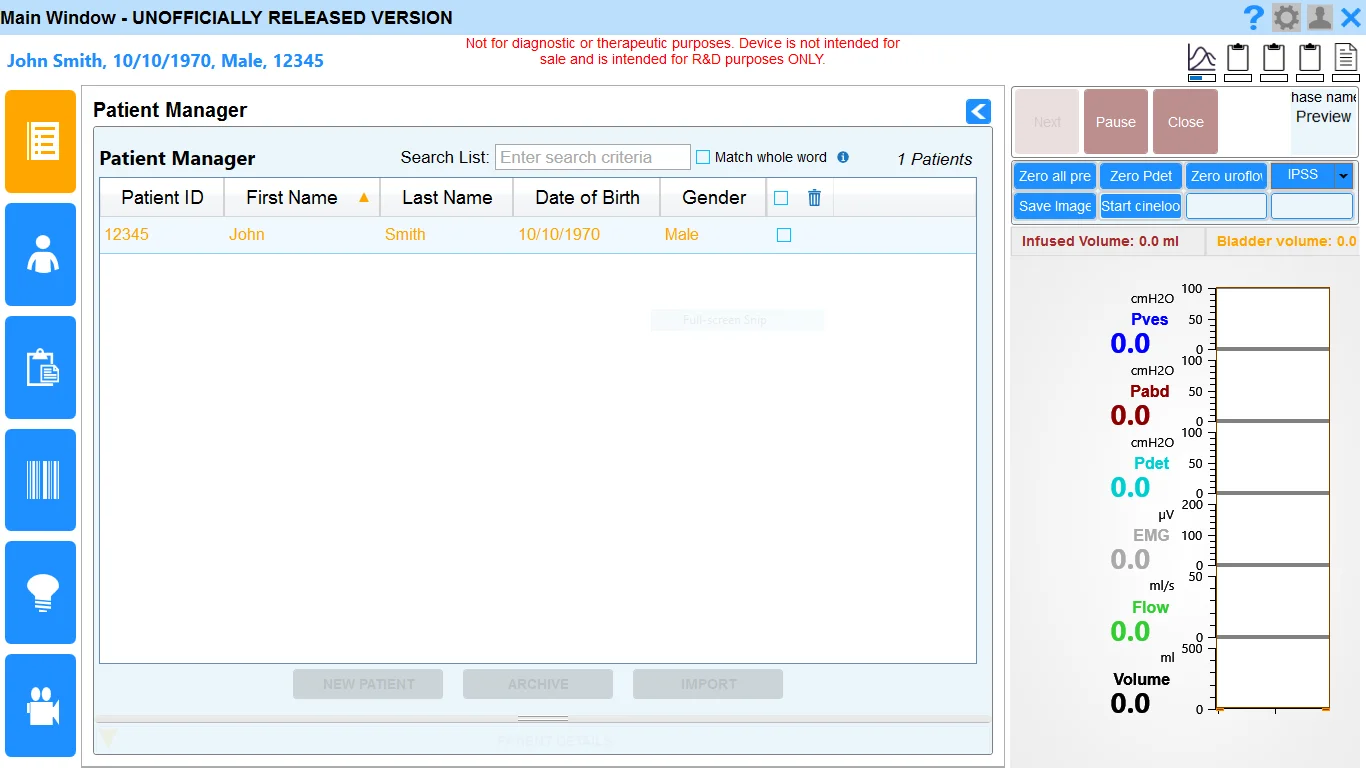
You can see from the “before” picture above; the existing user interface had a somewhat dated UI in terms of typography, iconography, colour palette and sophistication of visual design elements.
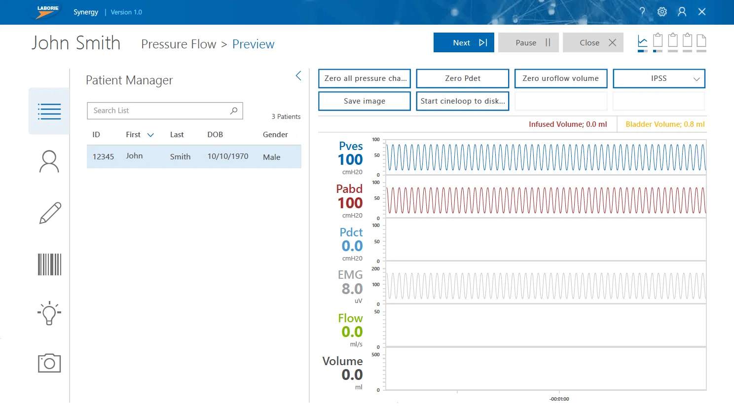
Synergy user interface after a UI facelift
The Interpix UI facelift addressed all these shortcomings along with optimizing fonts, introducing new intuitive controls elements, and aligning information hierarchy with a contemporary visual design system.
Consistent with many UI redesigns, we delivered more than a new pretty face. All the newly designed screens were tested with users and refined accordingly. Once complete, we developed and delivered pixel perfect front-end code to integrate into Synergy’s software back-end. To ensure future screens and UI elements stayed consistent with the redesign, we delivered interactive guidelines and a handy way for Laborie’s developers to instantly implement code snippets. The results? An otherwise dated and fairly standard user interface was quickly brought up to date. Users could “learn” the interface quicker and more importantly - instantly get done what they needed to do.
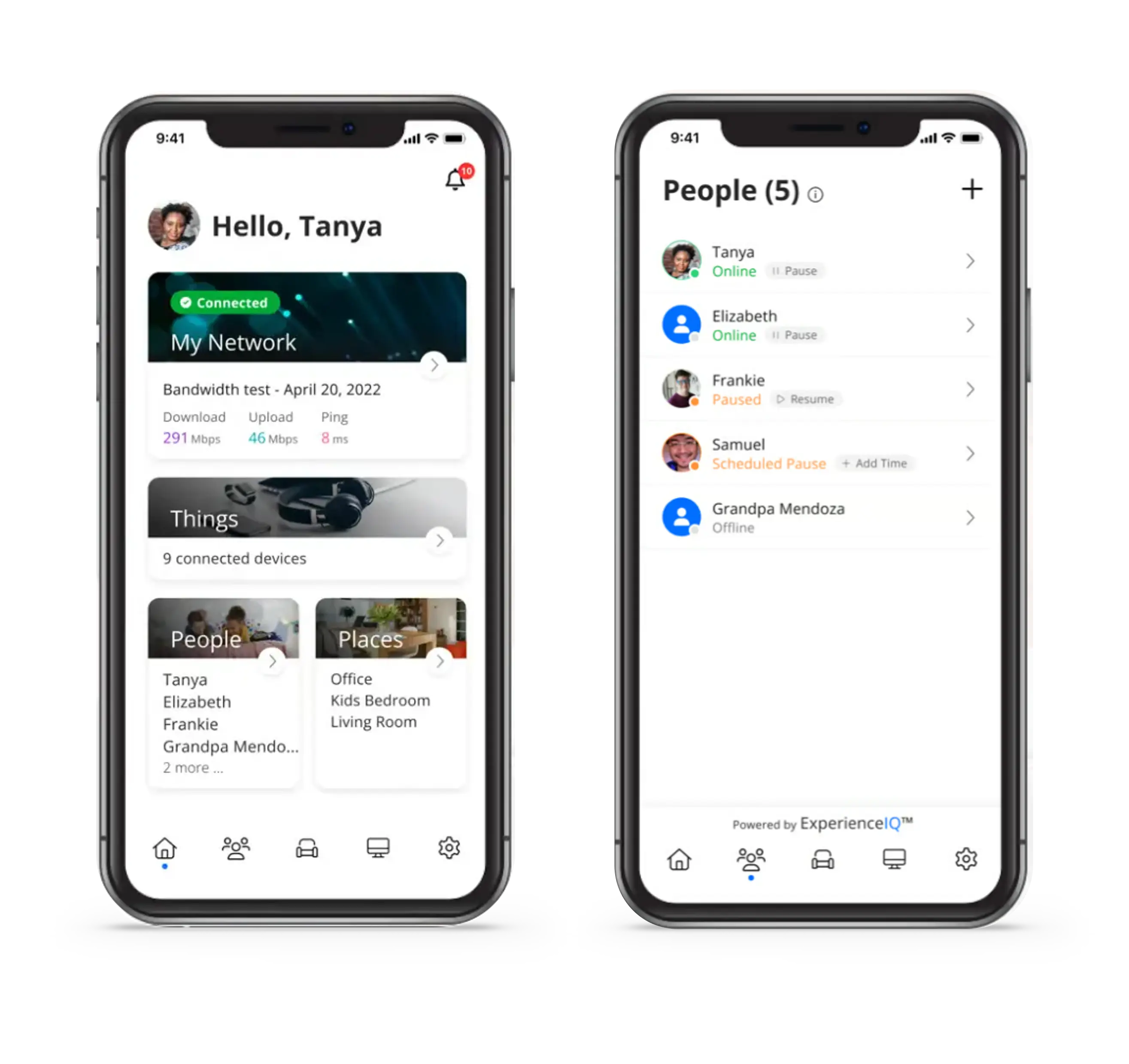
UI facelift Example 2: Teranet-National Bank House Price Index (HPI)
Here is an example of a bigger UI facelift. The Teranet-National Bank House Price Index (HPI) is the leading independent index showing up-to-date information about Canadian home prices. Developed to be a trustworthy benchmark for financial professionals, the HPI is often cited by the media and used by real estate professionals, academics and government entities.
Interpix was engaged to redesign and update their existing website and bolster the ability for users to interact with large amounts of data in a visually engaging way. The site also needed to be made responsive so it would work across all mobile devices, and the new UI needed to integrate with an existing content management system. A classic UI facelift project!
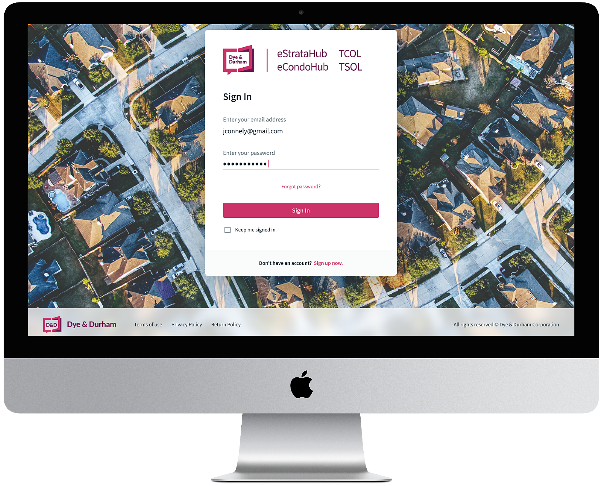
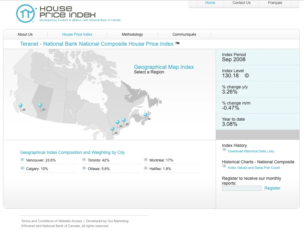
Teranet-National Bank House Price Index (HPI): Before
The existing HPI website presented house price index data in a relatively static way and forced the user to “dig around” a bit to get satisfaction. Visual design elements and type blended together and didn’t give the user’s eye an obvious journey. The light blue on light grey palette was a bit “washy”.
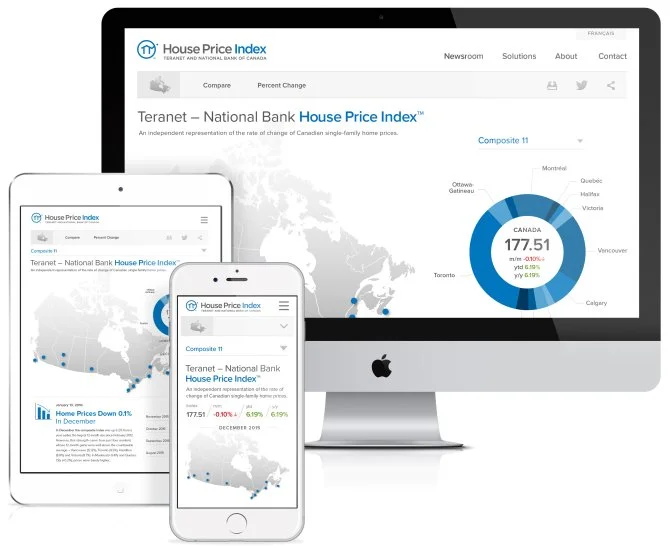
Teranet-National Bank House Price Index (HPI): After
We took the existing house price data and designed an interactive “visualizer”. This lets users understand – and engage with – changing house prices for all the major Canadian markets. Users can quickly get an overview of current prices and quickly drill down to info about a specific city. To make the essential parts of the site “pop”, we introduced new typography and a colour system that provided increased contrast and guides the user’s eye to the most important elements of the website. In updating the typography and colour palette, we also re-imagined the House Price Index wordmark so that it worked with the site and now stood on its own.
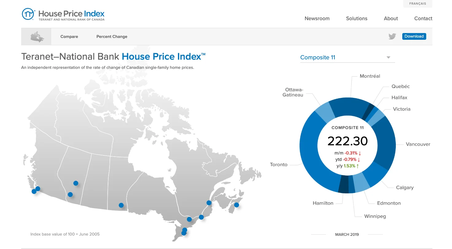
In keeping with contemporary design standards and user expectations, we added icons for social integration and a direct download button for immediate access to a deeper dive of the HPI. And, of course, we designed the UI to work perfectly on mobile devices of any size.
The benefits of this UI facelift were extensive. The new UI delivered a stronger user experience all round by letting customers immediately interact with and consume HPI data. Users can now quickly understand changing house prices at both the national and regional levels, and easily dig a little deeper into the numbers. A new modern look brought the site up-to-date, and by ensuring it works on mobile devices, all types of users can seamlessly access HPI data on the go.
The site is now easier to navigate, which has increased traffic and repeat visitors. The new UI has also increased on-site conversions by giving one-click access to data downloads for off-site use. The updated typography and wordmark have solidified the HPI brand, and the user interface’s contemporary feel helps it stand out in an ever-increasing competitive market.
UI Facelifts: The payoff
At Interpix Design we’ve done lots of both complex UX design projects and more straight-ahead UI design facelifts. In doing so, we’ve learned that sometimes, you don’t need to reinvent the wheel.
Your website, app or software might already have all the right elements and functionality – but you just need to bring its visual design in-line with modern standards and user expectations. To make sure you are reaching your maximum audience, it’s critical that your user interface work well across all mobile devices and adhere to (or exceed) accessibility standards. For websites in particular, to increase site traffic and on-site conversions you need a modern, proven-to-work user interface that’s tested with real-world users. A clean, contemporary UI that’s easy to understand will help you rank higher in search and help your brand keep pace with the competition.
Contact the UI design experts at Interpix Design today to talk about your website, app or software and see if it could benefit from a professional UI facelift.
Contact Us Today!